Rude Health
Role:
Art Director > Lead Designer
I was responsible for overseeing the creative output for Rude Health’s creative team. As a small but mighty team we produced almost everything in-house meaning no day was the same: from shopper marketing and NPD launch collateral, to photoshoots, trade show stands and concept packaging redesigns. This was a fast-paced role which required strategic planning and good management skills.
As Lead Designer, I was asked to come up with new packaging design concepts for their dairy-free milk range. Inspired by Rude Health’s ‘glass half full’ and ‘up for lifers’ adventurous spirit, I focused on heroing the product ingredients and integrating them into an active, ‘up for life’ scene; perfectly enticing our target audience: affluent, adventurous and health conscious.
I was careful to keep their iconic ‘bold’ and ‘bright’ aesthetic, but worked hard to add the ingredients in a hyper-realistic way, cuing the prominence of the natural ingredient to appeal to the health conscious consumer. The integrated milk splash was the final ‘taste’ cue of the product inside the pack.
Unfortunately, it was decided further along the line that we weren’t going to address packaging for any of our other product ranges, meaning this would have been too far away from our existing brand world and would not sit cohesively.
Concept dairy-free milk packaging
Concept dairy-free yogurt packaging
In addition to their dairy-free milk offering, the innovation team were working on a dairy-free yogurt alternative. Starting with two flavours: strawberry and blueberry as well as a plain option, I was asked to “reimagine” the world of dairy-free yogurt alternatives. In keeping with the idea of ‘glass half full’ and ‘up for lifers’, I lent on our strong partnerships with lidos across the country (see right) targeting our active health conscious consumers. The swirly milk-like background was there to cue taste as well as the patterned clothing made up of our hero ingredients. This was further supported by the yogurt spoon and ingredients (bottom right) — all with an overall aesthetic which felt creamy and delicious.
NPD Launch:
Barista Campaign Photography
With the launch of our new Oat Barista, we were tasked to create a set of campaign lifestyle images which celebrated the “creaminess”, “frothiness” and “tastiness” of our 4 barista products. I worked with my team to come up with a set of images which captured the versatility of the product USPs ‘from dusk till dawn’, highlighting the diverse serving occasions. Drawing on the bold colourful packs we used this as a guide for props and the overall direction for each shot; using the accent yellow from the logo to tie it all together.
Barista Trade Show Stand Design
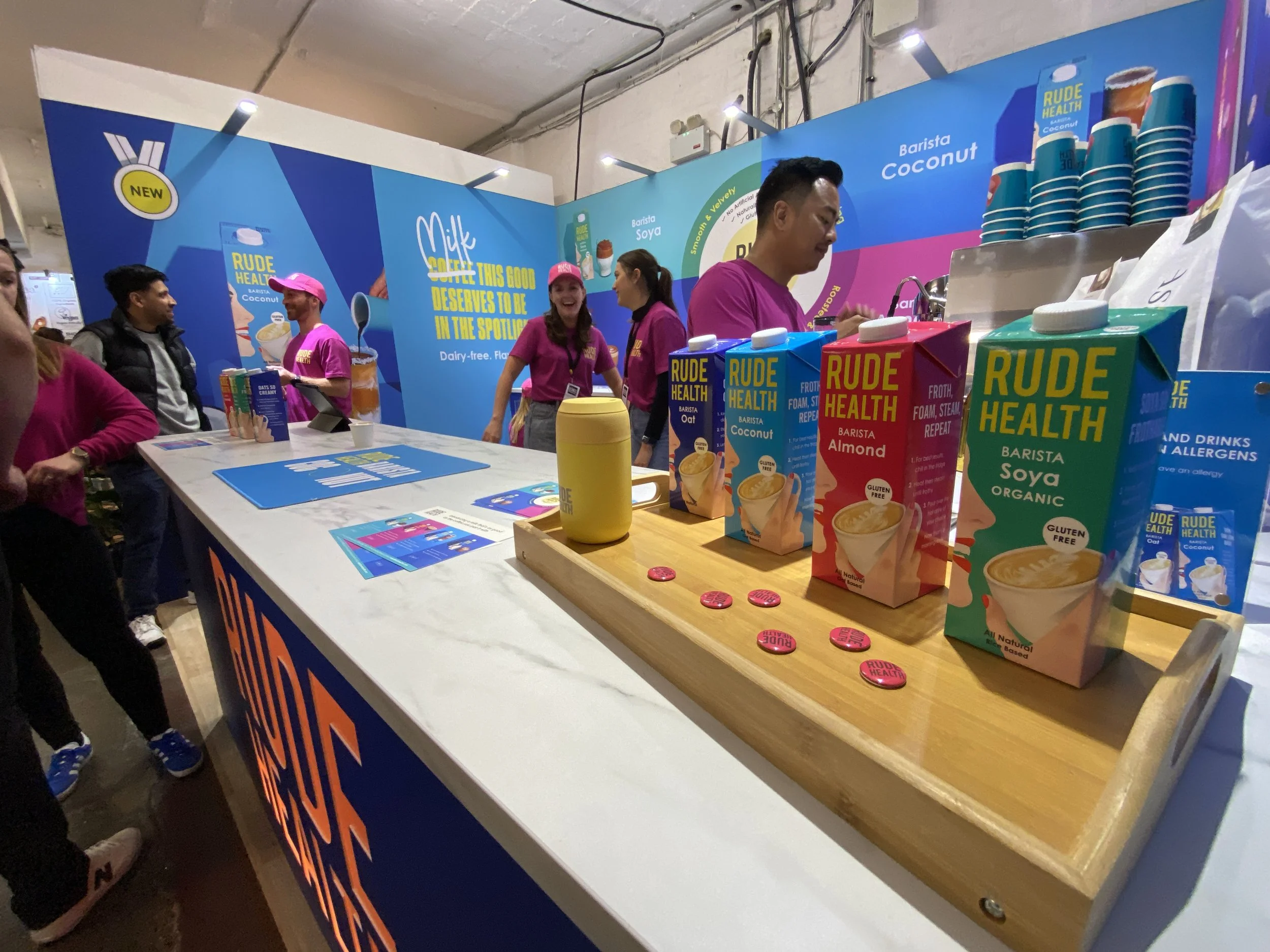
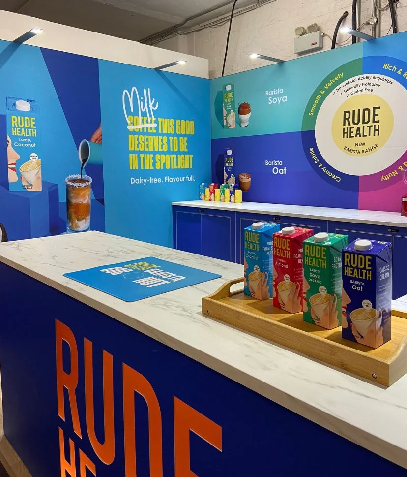
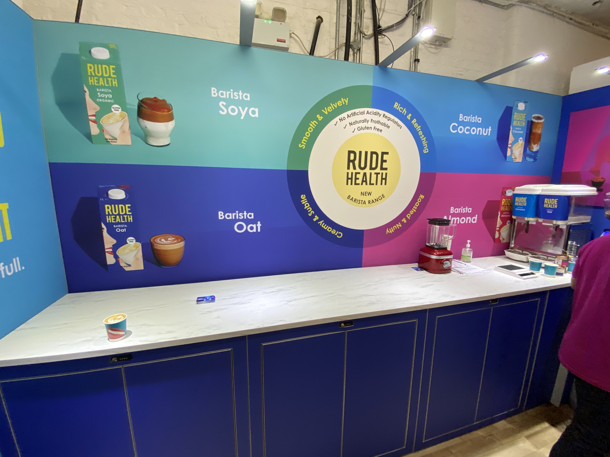
We were exhibiting at The London Coffee Festival to support the launch of our new Oat Barista SKU. With a plethora of coffee brands out there; highlighting their nuttiness, creaminess and “signature blends”, we felt the milk you choose to go with the coffee is just as important. That’s why we turned the narrative on its head and created a campaign to put the ‘spotlight’ on the milk for a change.
We created a set of four new Barista images — each one with the spotlight heavily on them, as well as celebrating the diversity of each product’s serving occasion: iced coconut coffee, creamy oaty latte, nutty espresso martini and deliciously smooth soya. This was turned into a bright bold stand at The London Coffee Festival which drew in the crowds of coffee AND milk lovers.
Rude Health Onboarding Pack
The previous branding was a little outdated and needed a little freshen up rather than a complete overhaul. This was the first project to be born out of a fresher more vibrant look to bring the world of Rude health up to date; the playfulness of layered type with the full bleed imagery, the boldness of the 4 brand colours and the cleaner approach to layout was the true success of this project.
NPD Art Direction
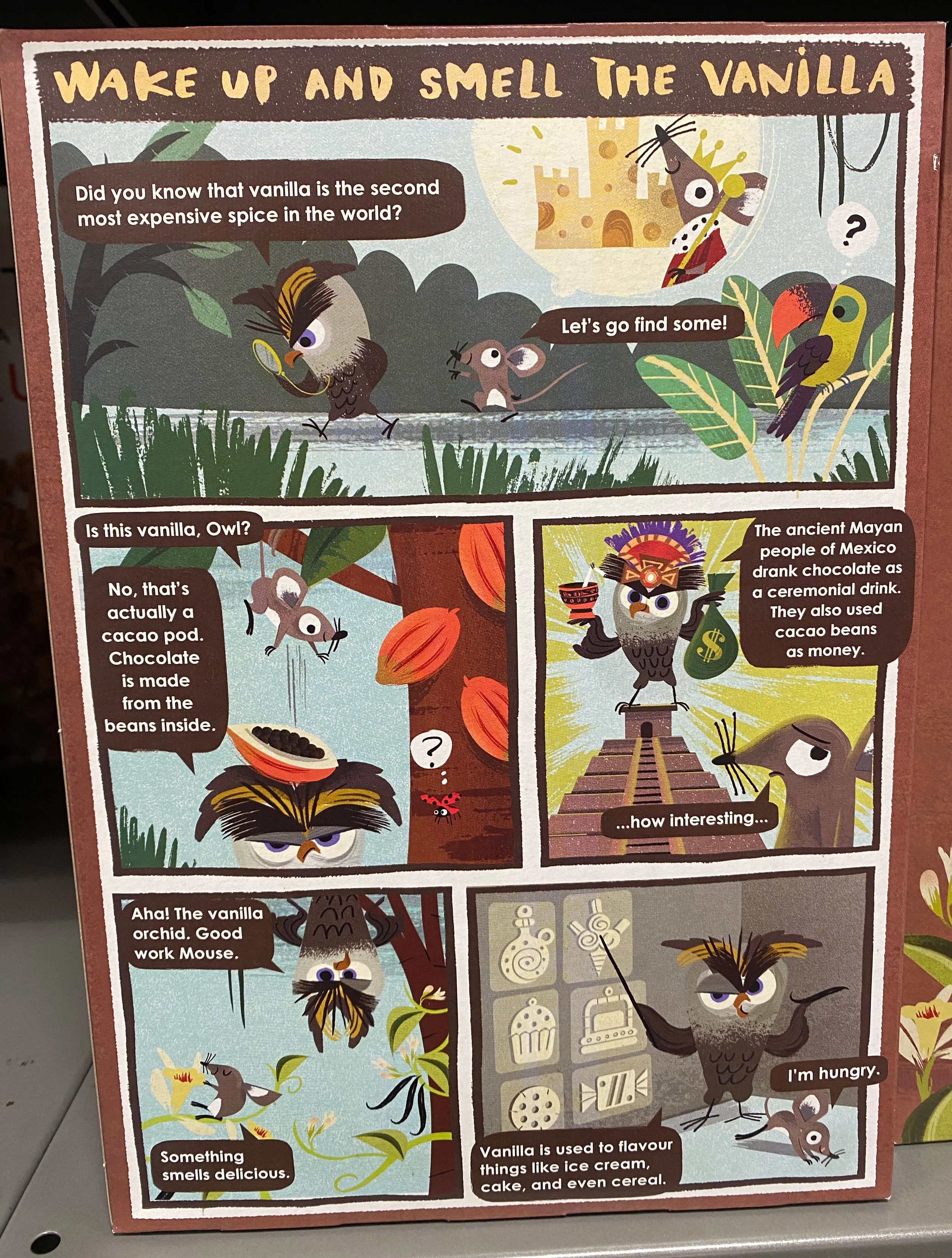
For the launch of our new healthy cereal: choco vanilla puffs for kids, I art directed the packaging design, working closely with the innovation manager, illustrator and external art working agency. This included brainstorming story ideas to go on the back of the pack where we worked together to come up with a story children would love to read at breakfast.
Brand Guidelines
One of the biggest jobs during my time at Rude Health was to design a set of interactive Brand Guidelines for both internal and external use; defining core design principles, to ensure consistency across their brand world.


